2010年6月13日星期日
Art Gallery & Shop, House - Initial Idea
 The initial idea comes from the inspiration of overlaped playing cards. Site 1 remains its character of 'narrow' regarding to the width. So, SEEKING the way through the whole site becomwes the main aspect for the experiment. Through the initial skectch below, it could be seen that the way was defined more like an adventure path that leads people go through the whole site and makes itself interesting. People sort of playing around within such a small scale building area. Although there is only 30m permition to build the site, turnings help to extend the length of the way. Different shapes are naturally created by intersecting the squares which could represent different functions of the space.
Those sketches shows how the circulation of the site works and the way guiding through between the spaces. As there is a King St in front which brings a lot of traffic and pubilc and also from the park behing the site, creating a double entrance will enhance the activities surround the gallery.
 Start to divide the whole site into three different functional parts, which presents as gallery - courtyard - personal space at behind in order to keep the privacy. 'Look at each other' is another key idea of my design that maximizes the different views happen in the gallery. Making level differences increases the optical range within such a small space. Same idea applying on the unit that makes second level as a double height space to optically looks large.
 According to this project, there is a large use of glass for different purposes. One of them is for obtaining the natural light into the buiding and engaging the building with the environment. Anotherone is taken into consideration of making space large that how people could see through the glass sometimes and sometimes not.
Ventilation was seriously taken into consideration during the design process. The whole site is a bit slanted regarding to the north point. In order to avoid the direct sun light from the west facade and gain the ventilation at the same time, I was putting several gaps on that facade wall. It makes the interior of gallery space feel cooling during the summer, meanwhile still recieve the natural light to bright the indoor space. That's why some places use semi-tranperant as the window material to prevent the direct sunlight and can still bright the space.
Overall, the gallery is built just next to the personal space, however, they are quite seperate in terms of the entrance that they have got different accesses to each functional space.
2010年5月9日星期日
Presentation of Project 2


 Lady Writting a Letter with her Maid is a painting by the Dutch artist Johannes Vermeer, completed between 1670-1671 and held in the National Gallery of Irland. The work shows a middle-class woman attended by a maid who is presumably acting as messenger and go-between for the lady and her lover. The work is seen as a bridge between the quiet restraint and self-containment of Vermeer's work of the 1660s and his relatively cooler work of the 1670s.
KEYWORDS FROM THE PAINTING: Freedom, Interaction, Social Hierachy
Reasons for choosing the site in HAWAII
1. SUNNY environment represents kind of sense of freedom, associating with the view of OCEAN.
2. MIXED CLIMATE provides varise possiblities in terms of forming the space.
3. Based on personal experience, beach environment makes me feel to go.
1. Create the opening all around the space to portray a sense of "FREE TO GO AND GEI IN".
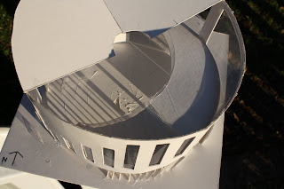
2. Dividing the circle shape into 4 parts to present different functions based on different climate characters on each direction.
3. Put glasses on the centre of the space together with the gutter on the floor to create a water-environment especially during raining. However, glasses will highly reflect the natural light during the day when its not raining to bright the interior space.
1. Put a small beam under the roof to create a small gap to gain the vantilation through the building especailly on the upper level which there is not many opening on that.
2. Make it as a circle shape, aiming to naturally form a central wind floating system to cool the space due to the highly humid place comditions.
订阅:
评论 (Atom)


